Case study · Product Design · Accessibility · Self-Checkout

Grab & Go

Reimagining self-checkout: faster, smarter, and frustration-free.

Role
UX, UI, Interaction Design · Research · Prototyping
Product
Mobile App / Self-Checkout System
Duration
36 weeks
Research
Field studies · Bangalore, Delhi, Ahmedabad
Focus
Accessibility · Design systems · Microinteractions
Year
2023
TL;DR

In 2023, self-checkout kiosks promised speed but delivered friction: scanning errors, bagging alerts, and constant waits for staff help. I joined a small team to reimagine this everyday interaction used by millions but enjoyed by few. Over 36 weeks, I led UX research and strategy, ran field studies across Bangalore, Delhi, and Ahmedabad, and designed Guided Checkout, an adaptive, confidence-score-driven system that surfaces the right action only when needed. In prototype testing: checkout 30 to 45 seconds faster, staff interventions down 50%, and 0 users confused by the new flow.
01 · Rethinking the checkout

A daily interaction used by millions, enjoyed by few.

In 2023, using a self-checkout kiosk often felt like a gamble. What should've been quick turned into a cycle of alerts, bagging errors, and waiting for help.

I joined a small team of designers and engineers to reimagine this daily interaction, used by millions, enjoyed by few. Our goal was simple: make self-checkout seamless, intuitive, and accessible for all.

Design by accretion

Self-checkout kiosks evolved from niche experiments to mainstream fixtures in supermarkets worldwide. What started as a quick, convenient option became the default for millions. But as usage grew, the system was patched together rather than redesigned. Barcode scanners, bagging sensors, and payment options were added incrementally, each solving part of the problem but not the whole. Over time, the interface became a mismatched collection of decisions, losing the sense of innovation it once had.

Our mission wasn't just to revive the kiosk's original simplicity; it was to create a system meeting the needs of today's diverse users, from tech-savvy millennials to older adults using touchscreens for the first time.

01
Goal

Make checkout fast, intuitive, and predictable for everyone.

02
Goal

Minimize friction and confusion caused by the system.

03
Goal

Lay the groundwork for inclusive, scalable retail experiences.

02 · The challenge

Rebuild trust in 36 weeks.

As Lead Product Designer and UX Strategist, I led UX research and strategy for the self-checkout redesign. I worked with a cross-functional team to identify pain points and create a new interaction flow. Collaborating with Ayan Ahmad Khan on UI design and Budhil Raj Patel on technical strategy, we conducted field research, iterated on prototypes, and defined the north-star experience.

Kickoff

At the start, we didn't have a clear brief or a defined vision of what "better" looked like for self-checkout. But we shared a strong hunch: the experience felt slow, unpredictable, and unforgiving. To move forward, I partnered with Ayan to observe how real shoppers interacted with kiosks in busy supermarkets. No scripts, no assumptions. Just watching, listening, and tracking frustration as it unfolded in real time.

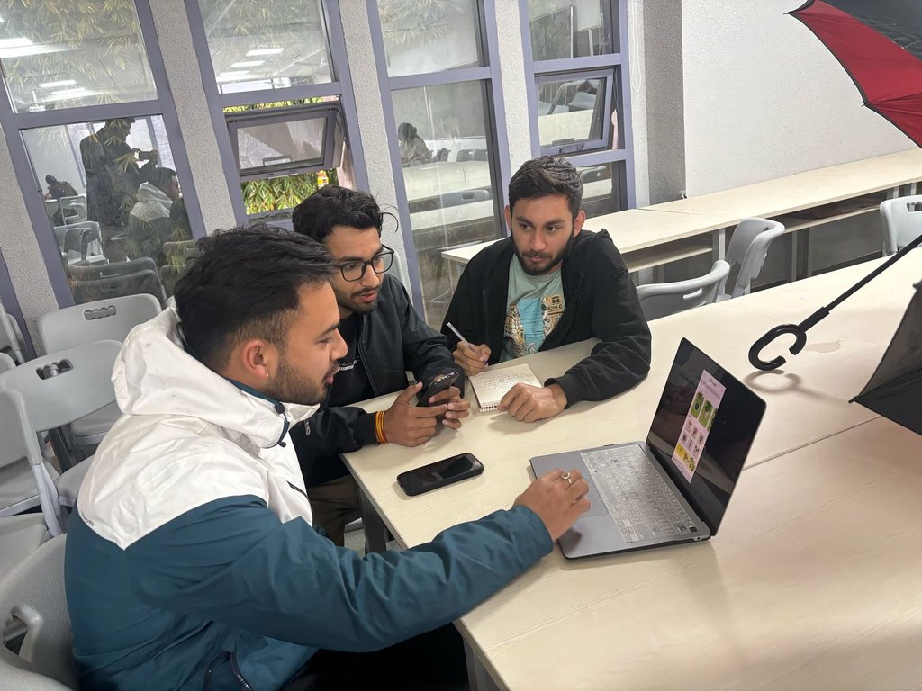
Three team members reviewing the self-checkout flow on a laptop together
Cross-functional review: synthesizing field findings with the team and iterating on the flow between rounds.
03 · Tracing the friction

Early insights from the field.

We watched shoppers across busy supermarkets and tracked where the experience broke down. Five patterns surfaced again and again.

01
Insight

Scanner hesitation

Shoppers hesitated before scanning, unsure how to position items or when they'd be recognized. Many adjusted the barcode repeatedly before it worked.

02
Insight

Bagging alert fatigue

Users were interrupted by "Unexpected Item in Bagging Area" alerts. Some hit "Skip Bagging," triggering security checks. Others called staff without trying to fix it.

03
Insight

Looking for confirmation

Many sought constant validation: checking the screen, waiting for beeps, looking to staff before acting. New users moved cautiously, afraid of mistakes.

04
Insight

Fast tappers vs. deliberate pressers

Some tapped rapidly when the UI lagged, causing errors; others pressed firmly and waited before continuing.

05
Insight

Last-minute payment confusion

At checkout, some hovered, unsure whether to tap, insert, or swipe. Digital payment options were often missed or met with hesitation.

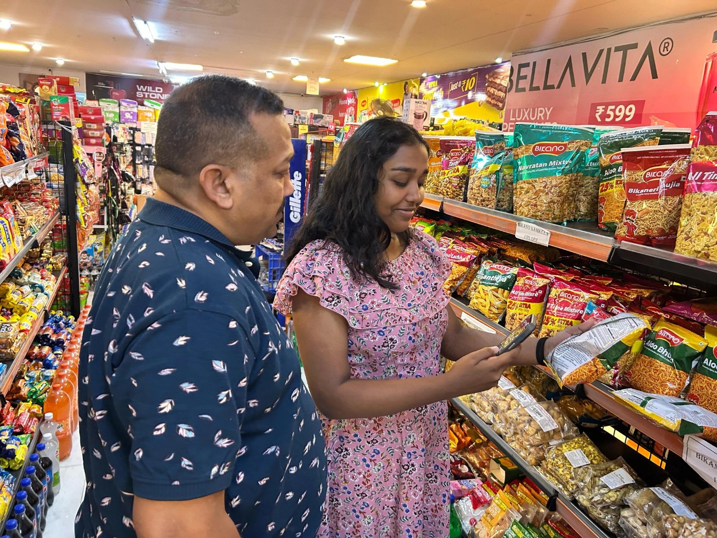
A shopper checking a snack package with their phone in a supermarket aisle while another person looks on
Field research in a real store: observing how shoppers actually move, hesitate, and decide. No scripts, no assumptions.
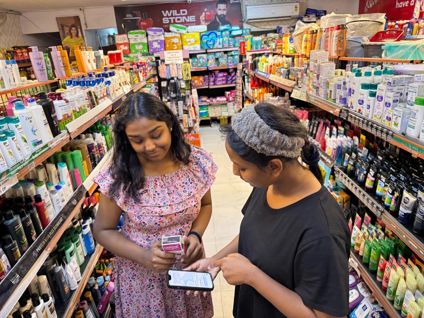
Two shoppers looking at a hair-color box and a phone together in a personal-care aisle
Watching real interactions in context: where shoppers paused, what confused them, and what they reached for help with.

Where the journey breaks down

Friction
Disruption
Approach kiosk
Self checkout
Scan items
Bag items
Review & confirm
Make payment
Exit
The bagging error loop. Frustration peaks at "Bag items": an "Unexpected item in bagging area" alert sends the shopper back a step, or straight to staff. This is where the experience collapses.

Frustration mapped across the checkout journey. The bagging step is where the experience collapses: the "bagging error loop" that sends users back, or to staff.

Evolving expectations

Initially, issues like misplaced barcodes and extra taps seemed minor. But as we analyzed behavior, it became clear shoppers expected a seamless experience, not something they had to "figure out." As self-checkout became common, users developed a mental model of how it should work. Delays and unclear prompts felt like unnecessary friction, and frustration grew not just with the system, but with the effort required. Improving usability wasn't enough. We needed to rethink the experience to make it intuitive and effortless.

Curiosity revealed an opportunity to make self-checkout effortless for everyone, everywhere.

If tech-savvy shoppers in well-equipped urban supermarkets struggled, hesitating at scanners, triggering errors, needing staff help, what did that mean for less experienced users in busier, less optimized environments? How much harder was it for elderly shoppers, people with disabilities, or first-time users? This curiosity led us to a clear opportunity: redefine self-checkout as an effortless, intuitive process for everyone. This became our north star.

04 · North Star signals & metrics

What "effortless" had to measure.

To hold ourselves to "effortless," we tied each goal to an observable signal and a metric we could move.

GoalSignalMetric
The checkout process begins seamlessly Hesitation at kiosk, user confusion Time to first action, % needing assistance
Barcode scanning is smooth Failed scans, retry rate Avg scan success rate, scan attempt frequency
Bagging items is intuitive Unexpected bagging alerts, staff interventions Bagging error rate, assistance requests
System feedback is clear and actionable Pauses after errors, unsuccessful retries Error resolution time, % resolved without help
Payment is quick and effortless Hesitation, multiple attempts Time to complete payment, payment retry rate
The system is accessible for all users Difficulty for elderly/disabled, small UI Accessibility score, satisfaction rating

The discovery: most self-checkouts require additional effort

The data revealed friction in nearly every session. Users frequently retried barcode scans, adjusted bagging placements, or sought staff help. Mistakes led to hesitation, backtracking, and trial-and-error. The experience was far from the seamless, independent process it was intended to be.

Impact on revenue and customer experience

In high-footfall supermarkets, inefficiencies led to long queues, abandoned purchases, and frustrated customers, directly affecting sales and satisfaction. In a city like Delhi, with thousands of daily transactions, these inefficiencies caused significant weekly revenue loss, especially during peak hours.

Reframing the problem

The self-checkout system, instead of simplifying, adds friction at key touchpoints: unreliable scanning, confusing bagging errors, unclear feedback. Shoppers re-scan items, adjust groceries, or call for help, slowing transactions and increasing cognitive load.

★ Key question

How can we create a smoother, error-free checkout that guides users intuitively?

This led us to redesign the experience around real-world shopping behaviors: intuitive, efficient, and error-free.

05 · The redesign

Introducing Guided Checkout.

Guided Checkout transforms self-checkout into a seamless, intuitive process. By reducing friction at every step, it makes smart real-time adjustments and gives clear, actionable feedback.

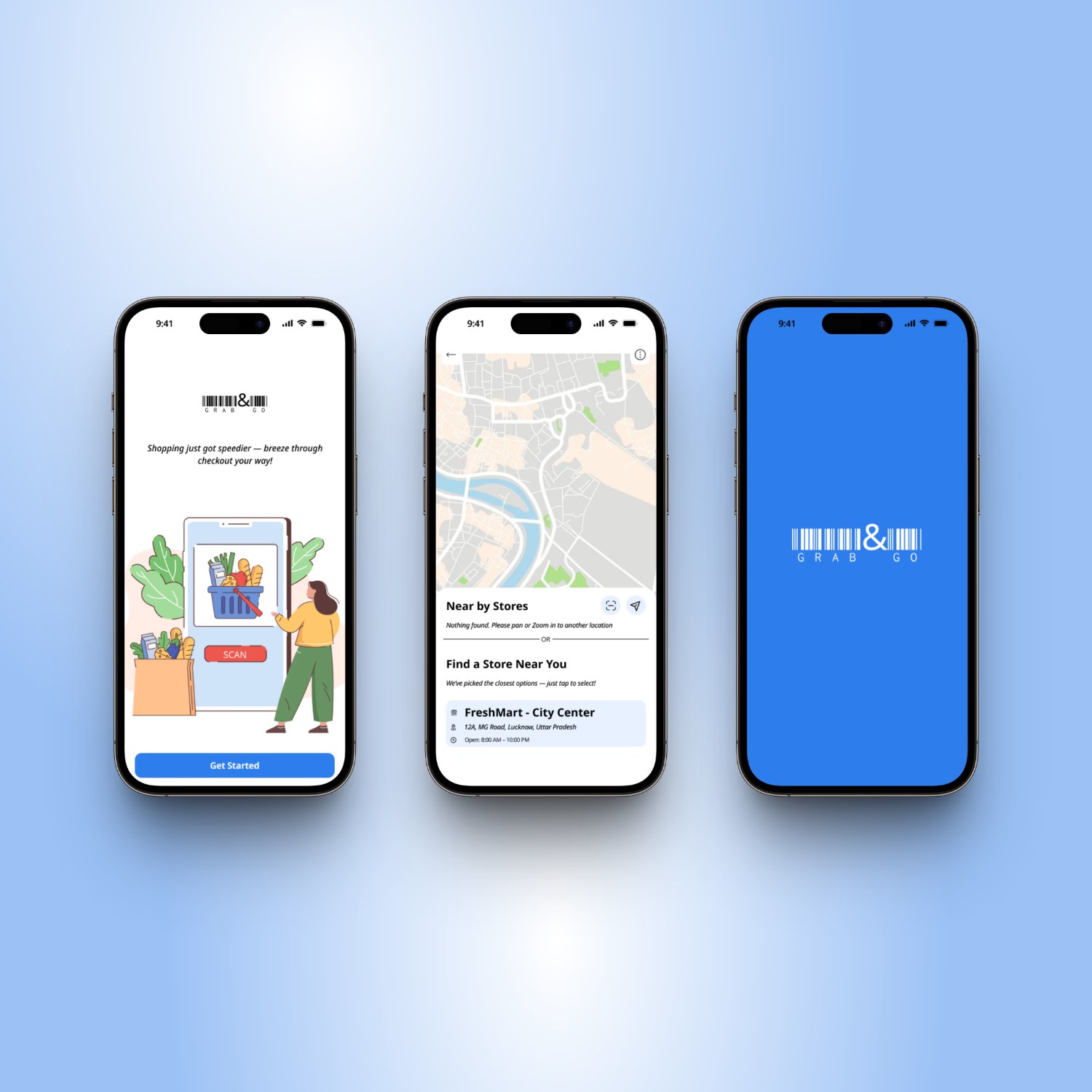
Three Grab & Go onboarding screens: a Get Started entry point, a store locator map, and the branded splash
Onboarding into Guided Checkout: a clear entry point, store locator, and branded splash. Shopping starts with orientation, not confusion.

Three signals that build trust

Signal 01

Scanning confirmation

Users know the system registered their items. Every scan lands with clear, immediate feedback.

Signal 02

Payment status

Unambiguous clarity that the transaction has gone through and is complete.

Signal 03

Completion signal

Users know they can leave, with no lingering doubt about whether something is still required.

↑   The transaction process   ↑

Trust at checkout comes from three clear signals: did it scan, did it pay, can I go. Removing doubt at each was the difference between confidence and hesitation.

A more inclusive checkout experience

Traditional self-checkouts assume tech-savvy, unchallenged users. To address this, I designed for everyone, considering spectrums (temporary or permanent challenges) and situations (managing kids, rushing for a train). Moving away from one-size-fits-all, we prioritized flexibility and scalability, shifting from efficiency to inclusivity.

Designing for spectrums and situations

Spectrum who the user is: permanent traits

Tech literacy Physical ability Language proficiency Attention span Cognitive load Hand mobility Visual acuity Hearing sensitivity Familiarity with self-checkout

Situation what they're dealing with right now

Rushing Hands full Low battery Noisy environment Poor lighting Unfamiliar store With kids Wearing gloves Elderly user

Inclusive design means designing for spectrums (who the user is) and situations (what they're dealing with right now). Both shift the experience; neither fits the "default user" myth.

From degradation to adaptation

I created a Hierarchy of Needs framework to move from degrading features for tough environments to building inclusive solutions from the start. Instead of "How will this degrade in tough environments?" we asked "How can we design a seamless self-checkout for all users, regardless of constraints?" This kept a high quality standard: effortless, accessible checkout from high-tech urban stores to markets with limited infrastructure.

A hierarchy of needs for self-checkout

Elevating
Seamless · predictive · rewarding · engaging
Empowering
Effortless · adaptive · responsive · efficient
Enabling
Reliable · intuitive · accessible · transparent · secure
↓ Grounded: solving practical checkout inefficiencies first.
Future forward: designing a seamless, delightful experience. ↑

Rather than degrading features for hard environments, I built up from a stable base: enable first, then empower, then elevate.

Self-checkout systems often overlook those who don't fit the "default" user profile.

Working backwards from perfect

I flipped the perspective, analyzing what made existing systems frustrating. This led to four design challenges.

HMW 01

How might we make starting the checkout process effortless and intuitive?

HMW 02

How might we minimize scanning and bagging friction to save time?

HMW 03

How might we reduce reliance on trial-and-error with clear, real-time guidance?

HMW 04

How might we design for adaptability across different behaviors, layouts, and accessibility needs?

06 · Understanding shopper intent

Adaptive assistance, not manual correction.

Self-checkout errors often arise from unclear user intent: mis-scanned items, accidental selections, confusion over feedback. Instead of manual correction, we focused on intelligent, adaptive assistance.

40%
Of shoppers face errors from barcode scanning issues
1 in 3
Struggle with non-barcoded item lookups
50%
Of transactions involve payment friction, causing delays
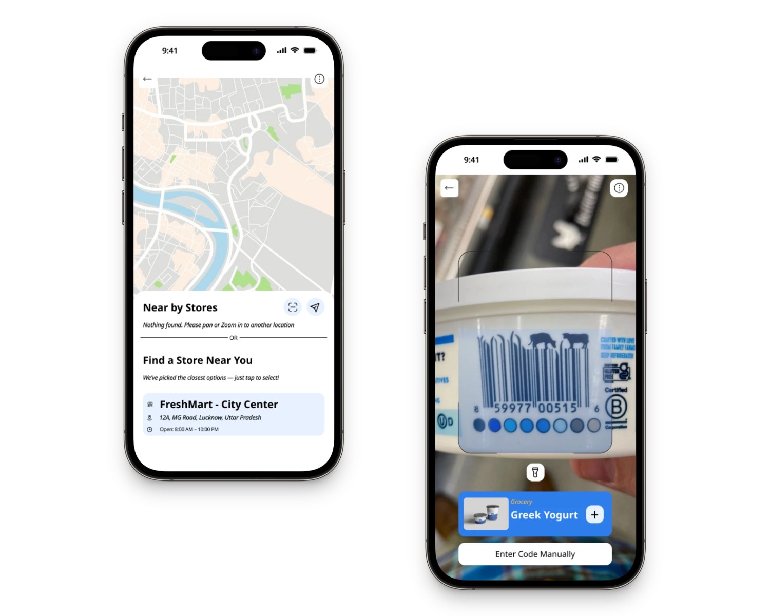
Two Grab & Go screens: a nearby-stores map and the live scanning view recognizing Greek Yogurt with a one-tap add
Find a store, then scan to add: the core loop. Item recognition surfaces the product instantly with a single tap to add.

From random scanning to real-time correction

Step 01
Random scanning
Items scanned in any order, with no guidance.
Step 02
Error encounter
Unreadable barcodes and mis-scans arise.
Step 03
Manual intervention
Corrections needed, which costs the shopper time.
Step 04
Intelligent suggestion
System suggests an optimal scanning order.
Step 05
Real-time correction
Errors fixed on the spot, before they stall.

The system learns the shopper's pattern and shifts effort from manual correction to real-time, on-the-spot guidance.

Smart Checkout Accelerators & de-risking

To optimize checkout, we focused on shopper intent. Asking "How would you like to pay?" at the right moment aligned with expectations: streamlining payment, reducing hesitation, and preloading likely options. I designed Smart Checkout Accelerators: predictive shortcuts offering 1-tap access to payment methods, bagging preferences, and receipt options.

To test our assumptions, we ran on-site usability sessions in Bangalore, Delhi, and Ahmedabad. To our surprise, not a single participant struggled with the adjusted flow. The scan-to-pay experience and quick payment shortcuts felt intuitive, even welcome.

Live Scanning: adapting to real behavior

Live Scanning emerged from a simple question: "Do users really need to follow a fixed checkout flow?" Instead of a rigid step-by-step process, Live Scanning adapts in real time, surfacing the right action (payment, bagging, receipt) only when needed. This shifted our mindset from "Here's how checkout works" to "How would you like to complete your purchase?" The result: a checkout flow that's faster, and feels more personal and intelligent.

07 · What I got wrong first

Over-designing for anxiety.

In early phases, I believed more visibility meant more trust. So I layered in confirmations, breakdowns, and verifications to reassure users. But testing told a different story:

  • Most users didn't read the breakdowns; they assumed the system was working.
  • The excessive feedback slowed people down, creating friction instead of reassurance.
  • The anxiety we felt as designers translated into the UI, without addressing real user concerns.

After three test rounds, I scrapped the complexity for a simplified, balanced interface: clear, but not overwhelming. The system became more invisible, letting users move forward with confidence, not caution.

08 · The adaptive framework

From inefficient to optimized.

We built a system that adapts, automating smartly and seeking input only when necessary. Three core principles carried it.

01
Principle

Confidence Score

The system gauges certainty for each scan. Confident? Auto-confirm. Uncertain? Prompt the user. This score improves through use.

02
Principle

User control is sacred

Flexibility to opt-in, skip, or adjust, without breaking the flow.

03
Principle

Fluid, not fixed

The system learns over time, evolving from rigid steps to dynamic guidance based on behavior.

The confidence-score flow

Customer starts scanning
System checks scan accuracy
Branch on confidence score
High confidence
Item validated
Proceed to payment
Checkout completed
Low confidence
Requests re-scan
Smart intervention prompts assistance
Rejoins the flow, never a dead stop

An adaptive flow driven by a confidence score: high confidence moves silently forward; low confidence prompts a gentle, specific intervention, never a dead stop.

Giving users back their time

The adaptive framework had to hold up against the messy reality of a real checkout. Each context maps to a clear user action and a defined system response.

ContextUser actionSystem responseNotes
Barcode scans successfullyScans itemConfirms and adds to cartStandard flow
Item has no barcodeSelects "No Barcode?"Prompts manual search or scan shelf tagAlternative method
Scanning errorScans, scanner fails"Scanning Error" + retryManual entry if retry fails
Duplicate scanScans same item twice"Already in Cart" messagePrevents duplicate charges
Age verificationScans restricted itemAlerts to wait for associatePrevents underage purchase
Weight-based itemSelects from touchscreenPrompts to weigh and confirmGuides weight pricing
Bagging issueMoves item without scanning"Item Not Scanned" alertPrevents shrinkage
Payment failureAttempts payment"Payment Declined" + retryAlternative payment
Checkout completeCompletes payment"Thank You" + exit guidanceStandard exit
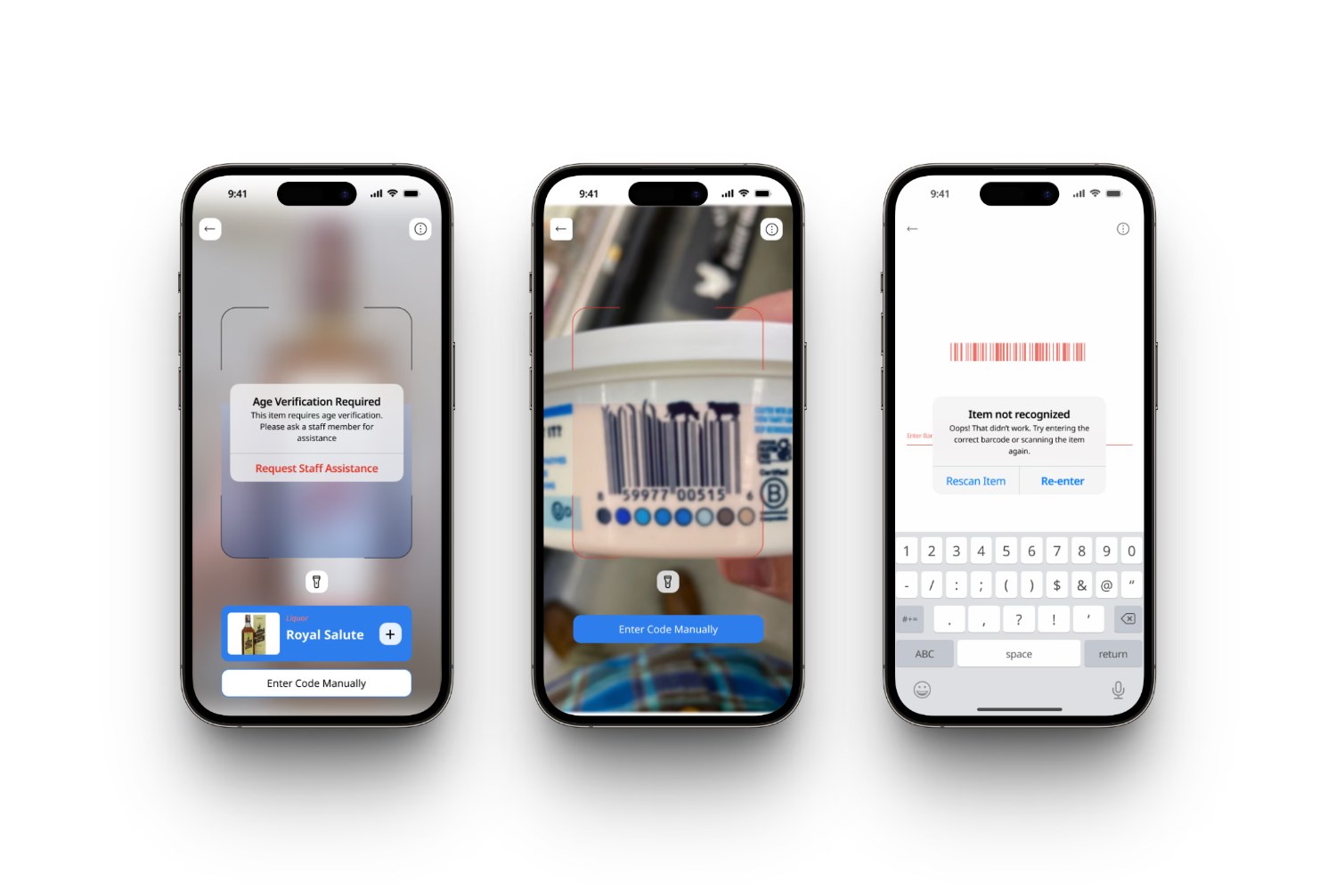
Three Grab & Go edge-case screens: age verification required, a barcode scan in progress, and an item-not-recognized recovery prompt
Designing for the hard moments: age verification, scan errors, and unrecognized items each get a clear, non-punishing path forward.

SmartCheckout: context-aware guidance

SmartCheckout is a dynamic guidance system mirroring how shoppers naturally interact. Using behavioral heuristics, it streamlines scanning, handles errors proactively, and simplifies payment. I modeled user behavior across real-world scenarios, revealing that intent, familiarity, and store environment heavily influence interactions. The long-term vision was a self-optimizing system adapting in real time; due to the complexity of full automation, we piloted a structured-yet-flexible version to validate key behaviors.

View the full UI map & annotated flow Every screen and state, from onboarding to invoice, with design rationale. Opens a dedicated full-screen page.
09 · Results & impact

SmartCheckout reduced friction.

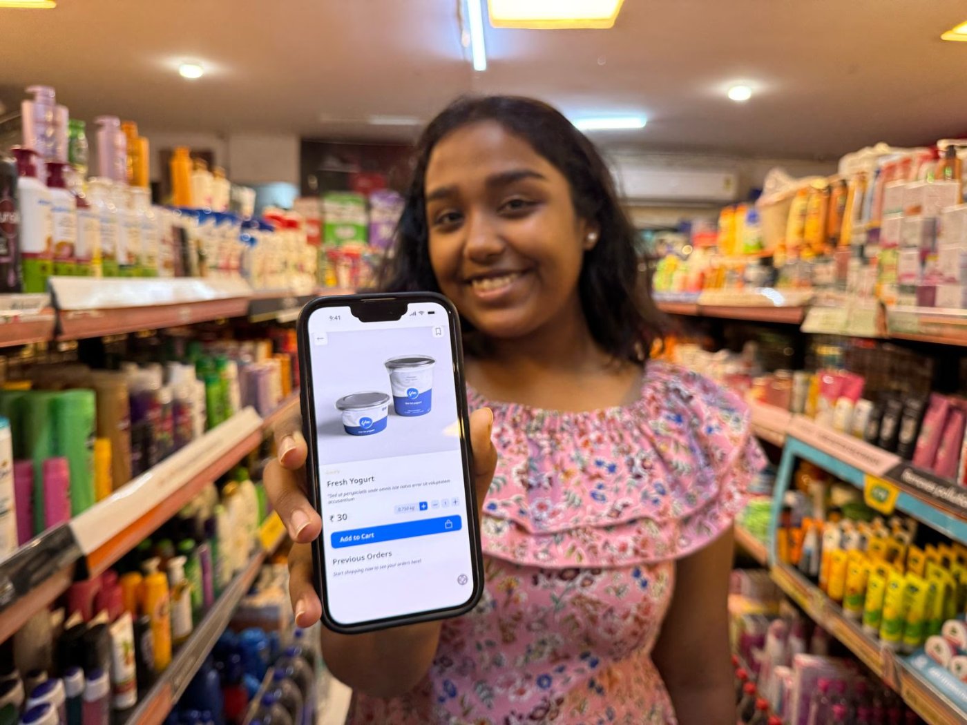
A smiling shopper holding a phone showing the Grab & Go product screen inside a real store
A real shopper using Grab & Go in-store: the moment the design left the file and met the world.

In initial prototype tests across Bangalore, Delhi, and Ahmedabad:

7/10
Users completed checkout without staff assistance
12/15
Users scanned all items without re-scanning
11
Participants described payment as faster or smoother
0
Users reported confusion about the adjusted flow

The impact: tangible gains

30–45s
Faster checkout on average
−50%
Support staff interventions in observed sessions
13/15
Users felt "more in control"; checkout anxiety decreased
15/15
Participants finished their transactions; zero abandonment
10 · Reflection

The honest close.

While promising, challenges like accommodating varied retail contexts and evolving user behavior remain. Continued refinement and real-world pilots will be key to SmartCheckout's success. Although still conceptual, this case study reflects a rigorous, real-world approach, from defining the problem to validating the solution.

We didn't set out to add features to a kiosk. We set out to make the system disappear, so the shopper could just grab, go, and trust that it worked.

Team: Ayan Ahmad Khan (UI Design) · Budhil Raj Patel (Technical Strategy).
My role: UX research & strategy, interaction design, prototyping, accessibility, design system.

Next case study

The Single Source of Financial Truth